What is Data Visualization?
- Data visualization or data visualisation is viewed by many disciplines as a modern equivalent of visual communication.
- It involves the creation and study of the visual representation of data.
- A primary goal of data visualization is to communicate information clearly and efficiently via statistical graphics, plots and information graphics.
- Data visualization is both an art and a science.
Data Visualization Tools
- There are vast number of Data Visualization Tools targeted for different audiences
- A few used by academic researchers
- Tableau
- Google Charts
- R
- Python
- Matlab
- GNUPlot
Data Visualization with Python
- Matplotlib is probably the most popular plotting library for Python.
- It is used for data science and machine learning visualizations all around the world.
- John Hunter began developing Matplotlib in 2003.
- It aimed to emulate the commands of the MATLAB software, which was the scientific standard back then.
- Seaborn is a Python data visualization library based on matplotlib.
- It provides a high-level interface for drawing attractive and informative statistical graphics.
- Bokeh is an interactive visualization library that targets modern web browsers for presentation.
- Plotly, a Python framework for building analytics web apps.
- Plotly Express is a new high-level Python visualization library
- it’s wrapper for Plotly.py that exposes a simple syntax for complex charts.
- Plotly Express is a new high-level Python visualization library
Matplotlib
- Matplotlib is a Python 2D plotting library
- produces publication quality figures in a variety of hardcopy formats and interactive environments.
- Matplotlib can be used in
- Python scripts,
- Python and IPython shells,
- Jupyter notebook, and
- web application servers.
- Matplotlib tries to make easy things easy and hard things possible.
- Current stable version is 3.0.3
- Matplotlib 3.x is only supported in Python 3
Overview of Plots in Matplotlib
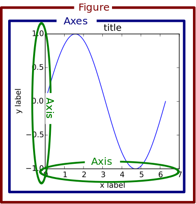
- Plots in Matplotlib have a hierarchical structure that nests Python objects to create a tree-like structure.
- Each plot is encapsulated in a Figure object.
- This Figure is the top-level container of the visualization.
- It can have multiple axes, which are basically individual plots inside this top-level container.
Components of Plot
- Figure : an outermost container and is used as a canvas to draw on.
- It allows you to draw multiple plots within it.
- It not only holds the Axes object but also has the capability to configure the Title.
- Axes: an actual plot, or subplot, depending on whether you want to plot single or multiple visualizations.
- Its sub-objects include the x and y axis, spines, and legends.
Anatomy of a Figure Object
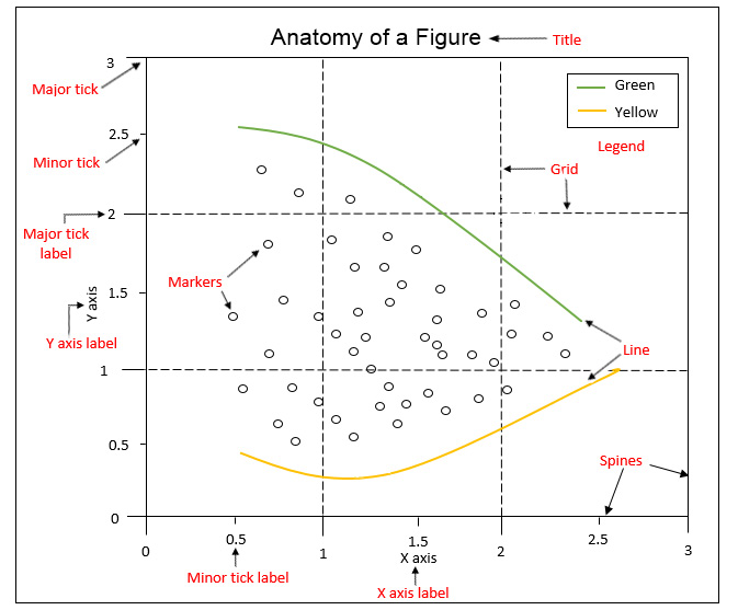
- Spines: Lines connecting the axis tick marks
- Title: Text label of the whole Figure object
- Legend: They describe the content of the plot
- Grid: Vertical and horizontal lines used as an extension of the tick marks
- X/Y axis label: Text label for the X/Y axis below the spines
- Major tick: Major value indicators on the spines
- Minor tick: Small value indicators between the major tick marks
- Major/Minor tick label: Text label that will be displayed at the major/minor ticks
- Line: Plotting type that connects data points with a line
- Markers: Plotting type that plots every data point with a defined marker
Interfaces
Matplotlib provides two interfaces for plotting
- Stateful interface using Pyplot
- Stateless or Object Oriented interface
The stateful interface makes its calls with plot() and other top-level pyplot functions.
- There is only ever one Figure or Axes that you’re manipulating at a given time, and you don’t need to explicitly refer to it.
- Modifying the underlying objects directly is the object-oriented approach.
- We usually do this by calling methods of an Axes object, which is the object that represents a plot itself.
Pyplot Interface
- pyplot is a collection of command style functions that make matplotlib work like MATLAB.
- contains a simpler interface for creating visualizations, which allows the users to plot the data without explicitly configuring the Figure and Axes themselves.
- Each pyplot function makes some change to a figure: e.g., creates a figure, creates a plotting area in a figure, plots some lines in a plotting area, decorates the plot with labels, etc.
- They are implicitly and automatically configured to achieve the desired output.
- It is handy to use the alias plt to reference the imported submodule, as follows:
In [1]:
import matplotlib.pyplot as plt
import numpy as np
import pandas as pd
from IPython.display import Image
%matplotlib inline
Creating plots using Pyplot
- figure() creates a new Figure.
- plot([x], y, [fmt]), plots data points as lines and/or markers.
- By default, if you do not provide a format string, the data points will be connected with straight, solid lines.
- show() displays the new Figure.
In [2]:
plt.figure()
plt.plot([1, 2, 3, 4])
plt.show()

- By default, x is optional with values [0,1,...,N-1]
- to plot markers instead of lines, you can just specify a format string with any marker type
In [3]:
plt.plot([0, 1, 2, 3], [2, 4, 6, 8], 'o')
plt.show()

Plotting multiple data sets
- To plot multiple data pairs, the syntax plot([x], y, [fmt], [x], y2, [fmt2], …) can be used
In [4]:
plt.plot([2, 4, 6, 8], 'o', [1, 5, 9, 13], '-s')
plt.show()

- Any Line2D properties can be used instead of format strings to further customize the plot.
In [5]:
plt.plot([2, 4, 6, 8], color='blue', marker='o', linestyle='dashed', linewidth=2, markersize=12)
plt.show()

Saving Figures
- savefig(fname) saves the current Figure.
- There are some useful optional parameters you can specify, such as dpi, format, or transparent.
In [6]:
plt.figure()
plt.plot([1, 2, 4, 5], [1, 3, 4, 3], '-o')
plt.savefig('lineplot.png', dpi=300, bbox_inches='tight')
#bbox_inches='tight' removes the outer white margins

In [7]:
Image("lineplot.png")
Out[7]:

Formatting the style of your plot
- Labels: The xlabel() and ylabel() functions are used to set the label for the current axes.
- Title: The title() function helps in setting the title for the current and specified axes.
- Text: The figtext(x, y, text) and text(x, y, text) functions add a text at location x, or y for a figure.
- Axes Limits: The axis() command takes a list of [xmin, xmax, ymin, ymax] and specifies the viewport of the axes.
- Alternatively, use xlim(xmin,xmax) and ylim(ymin,ymax) to set axis limits
- Gridlines: The grid() command adds a grid to your plot
In [8]:
def myplot():
X = np.linspace(-2*np.pi, 2*np.pi, 256,endpoint=True)
C,S = np.cos(X), np.sin(X)
plt.figure(figsize=(10,6), dpi=80)
plt.plot(X, C, color="blue", linewidth=2.5, linestyle="-",label="cosine")
plt.plot(X, S, color="red", linewidth=2.5, linestyle="-",label="sine")
# Set x limits
plt.xlim(-3*np.pi/2,3*np.pi/2)
# Set y limits
plt.ylim(-2.0,2.0)
# Set x and y ticks with ticklabels
plt.xticks([-3*np.pi/2, -np.pi, -np.pi/2, 0, np.pi/2, np.pi, 3*np.pi/2],
[r'$-3\pi/2$', r'$-\pi$', r'$-\pi/2$', r'$0$', r'$+\pi/2$', r'$-\pi$', r'$3\pi/2$'])
plt.yticks([-2, -1, 0, +1, +2],
[r'$-2$', r'$-1$', r'$0$', r'$+1$', r'$+2$'])
plt.xlabel('x')
plt.ylabel('y')
plt.title(r'Plot of $sin(x)$ and $\cos(x)$')
In [9]:
myplot()
plt.text(0,1.5,"Some text at (0,1.5)")
plt.grid(True)
plt.show()

Annotation
- Compared to text that is placed at an arbitrary position on the Axes, annotations are used to annotate some features of the plot.
- In annotation, there are two locations to consider: the annotated location xy and the location of the annotation, text xytext.
- It is useful to specify the parameter arrowprops, which results in an arrow pointing to the annotated location.
In [10]:
def myplotannotate():
myplot()
t = 2*np.pi/3
plt.plot([t,t],[0,np.sin(t)], color ='red', linewidth=1.5, linestyle="--")
plt.plot([t,t],[0,np.cos(t)], color ='blue', linewidth=1.5, linestyle="--")
plt.annotate(r'$\sin(\frac{2\pi}{3})=\frac{\sqrt{3}}{2}$',
xy=(t, np.sin(t)), xycoords='data',
xytext=(+10, +30), textcoords='offset points', fontsize=16,
arrowprops=dict(arrowstyle="->", connectionstyle="arc3,rad=.2"))
plt.annotate(r'$\cos(\frac{2\pi}{3})=-\frac{1}{2}$',
xy=(t, np.cos(t)), xycoords='data',
xytext=(-90, -50), textcoords='offset points', fontsize=16,
arrowprops=dict(arrowstyle="->", connectionstyle="arc3,rad=.2"))
In [11]:
myplotannotate()
plt.grid(True)
plt.show()

Legends
- For adding a legend to your Axes, we have to specify the label parameter at the time of artist creation.
- Calling legend() for the current Axes or axes.legend() for a specific Axes will add the legend.
- The loc parameter specifies the location of the legend.
- Values for loc
- best/right/center
- upper/lower/center right/left
In [12]:
myplotannotate()
plt.grid(True)
plt.legend(loc='upper left')
plt.show()

Spines
- Spines are the lines connecting the axis tick marks and noting the boundaries of the data area.
- They can be placed at arbitrary positions and until now, they were on the border of the axis.
- There are four spines: left, right, top, bottom
- Use gca() to get current axes properties
- Use set to change various default options of spines
In [13]:
myplotannotate()
plt.grid(True)
plt.legend(loc='upper left')
ax = plt.gca()
ax.spines['left'].set_position('center')
ax.spines['right'].set_color('none')
ax.spines['bottom'].set_position('center')
ax.spines['top'].set_color('none')
ax.xaxis.set_ticks_position('bottom')
ax.yaxis.set_ticks_position('left')
plt.grid(False)
plt.show()

In [14]:
plt.bar(['A', 'B', 'C', 'D'], [20, 25, 40, 10])
plt.show()

- If you want to have subcategories, you have to use the bar() function multiple times with shifted x-coordinates.
- The arange() function is a method in the NumPy package that returns evenly spaced values within a given interval.
- The gca() function helps in getting the instance of current axes on any current figure.
- The set_xticklabels() function is used to set the x-tick labels with the list of given string labels.
In [15]:
import numpy as np
labels = ['A', 'B', 'C', 'D']
x = np.arange(len(labels))
width = 0.4
plt.bar(x - width / 2, [20, 25, 40, 10], width=width)
plt.bar(x + width / 2, [30, 15, 30, 20], width=width)
# Ticks and tick labels must be set manually
plt.xticks(x)
ax = plt.gca()
ax.set_xticklabels(labels)
plt.show()

Stacked Bar Charts
- A stacked bar chart uses the same bar function as bar charts.
- For each stacked bar, the bar function must be called and the bottom parameter must be specified starting with the second stacked bar.
In [16]:
import numpy as np
labels = ['A', 'B', 'C', 'D']
x = np.arange(len(labels))
bar1 = np.linspace(10,20,4)
bar2 = np.linspace(5,20,4)
bar3 = np.linspace(2,10,4)
plt.bar(x, bar1)
plt.bar(x, bar2, bottom=bar1)
plt.bar(x, bar3, bottom=np.add(bar1, bar2))
# Ticks and tick labels must be set manually
plt.xticks([0,1,2,3])
ax = plt.gca()
ax.set_xticklabels(labels)
plt.show()

Pie Charts
- The pie(x, [explode], [labels], [autopct]) function creates a pie chart.
- Important parameters:
- x: Specifies the slice sizes.
- explode (optional): Specifies the fraction of the radius offset for each slice. The explode-array must have the same length as the x-array.
- labels (optional): Specifies the labels for each slice.
- autopct (optional): Shows percentages inside the slices according to the specified format string. Example: '%1.1f%%'.
- Pie chart should be seldom used as tt is difficult to compare sections of the chart.
- Note: Pie Charts is not a good chart to illustrate information.
In [17]:
plt.pie([0.4, 0.3, 0.2, 0.1], explode=(0.1, 0, 0, 0), labels=['A', 'B', 'C', 'D'], autopct='%.2f')
plt.show()
n = 20
Z = np.ones(n)
Z[-1] *= 2
plt.axes([0.025,0.025,0.95,0.95])
plt.pie(Z, explode=Z*.05, colors = ['%f' % (i/float(n)) for i in range(n)])
plt.gca().set_aspect('equal')
plt.xticks([]), plt.yticks([])
plt.show()


Stacked Area Chart
- stackplot(x, y) creates a stacked area plot.
- Important parameters:
- x: Specifies the x-values of the data series.
- y: Specifies the y-values of the data series. For multiple series, either as a 2d array, or any number of 1D arrays, call the following function: plt.stackplot(x, y1, y2, y3, …).
- labels (Optional): Specifies the labels as a list or tuple for each data series.
In [18]:
plt.stackplot([1, 2, 3, 4], [2, 4, 5, 8], [1, 5, 4, 2])
plt.show()

In [19]:
# load datasets
sales = pd.read_csv('./data/smartphone_sales.csv')
# Create figure
plt.figure(figsize=(6, 4), dpi=100)
# Create stacked area chart
labels = sales.columns[1:]
plt.stackplot('Quarter', 'Apple', 'Samsung', 'Huawei', 'Xiaomi', 'OPPO', data=sales, labels=labels)
# Add legend
plt.legend()
# Add labels and title
plt.xlabel('Quarters')
plt.ylabel('Sales units in thousands')
plt.title('Smartphone sales units')
# Show plot
plt.show()

Histogram
- hist(x) creates a histogram.
- Important parameters:
- x: Specifies the input values
- bins: (optional): Either specifies the number of bins as an integer or specifies the bin edges as a list
- range: (optional): Specifies the lower and upper range of the bins as a tuple
- density: (optional): If true, the histogram represents a probability density
In [21]:
np.random.seed(19680801)
mu = 100 # mean of distribution
sigma = 15 # standard deviation of distribution
x = mu + sigma * np.random.randn(437)
bins = 50
plt.hist(x, bins=30, density=True)
# add a 'best fit' line
y = ((1 / (np.sqrt(2 * np.pi) * sigma)) *
np.exp(-0.5 * (1 / sigma * (bins - mu))**2))
plt.plot(bins, y, '--')
plt.xlabel('Smarts')
plt.ylabel('Probability density')
plt.title(r'Histogram of IQ: $\mu=100$, $\sigma=15$')
plt.show()

- hist2d(x, y) creates a 2D histogram. An example of a 2D historgram is shown in the following diagram:
In [22]:
# normal distribution center at x=0 and y=5
x = np.random.randn(10000)
y = np.random.randn(10000) + 5
plt.hist2d(x, y, bins=40)
plt.colorbar()
plt.show()

Box Plot
- boxplot(x) creates a box plot.
- Important parameters:
- x: Specifies the input data. It specifies either a 1D array for a single box or a sequence of arrays for multiple boxes.
- notch: Optional: If true, notches will be added to the plot to indicate the confidence interval around the median.
- labels: Optional: Specifies the labels as a sequence.
- showfliers: Optional: By default, it is true, and outliers are plotted beyond the caps.
- showmeans: Optional: If true, arithmetic means are shown.
In [23]:
# IQ samples
iq_scores = [126, 89, 90, 101, 102, 74, 93, 101, 66, 120, 108, 97, 98,
105, 119, 92, 113, 81, 104, 108, 83, 102, 105, 111, 102, 107,
103, 89, 89, 110, 71, 110, 120, 85, 111, 83, 122, 120, 102,
84, 118, 100, 100, 114, 81, 109, 69, 97, 95, 106, 116, 109,
114, 98, 90, 92, 98, 91, 81, 85, 86, 102, 93, 112, 76,
89, 110, 75, 100, 90, 96, 94, 107, 108, 95, 96, 96, 114,
93, 95, 117, 141, 115, 95, 86, 100, 121, 103, 66, 99, 96,
111, 110, 105, 110, 91, 112, 102, 112, 75]
In [25]:
# Create figure
plt.figure(figsize=(6, 4), dpi=100)
# Create histogram
plt.boxplot(iq_scores)
# Add labels and title
ax = plt.gca()
ax.set_xticklabels(['Test group'])
plt.ylabel('IQ score')
plt.title('IQ scores for a test group of a hundred adults')
# Show plot
plt.show()

In [26]:
group_a = [118, 103, 125, 107, 111, 96, 104, 97, 96, 114, 96, 75, 114,
107, 87, 117, 117, 114, 117, 112, 107, 133, 94, 91, 118, 110,
117, 86, 143, 83, 106, 86, 98, 126, 109, 91, 112, 120, 108,
111, 107, 98, 89, 113, 117, 81, 113, 112, 84, 115, 96, 93,
128, 115, 138, 121, 87, 112, 110, 79, 100, 84, 115, 93, 108,
130, 107, 106, 106, 101, 117, 93, 94, 103, 112, 98, 103, 70,
139, 94, 110, 105, 122, 94, 94, 105, 129, 110, 112, 97, 109,
121, 106, 118, 131, 88, 122, 125, 93, 78]
group_b = [126, 89, 90, 101, 102, 74, 93, 101, 66, 120, 108, 97, 98,
105, 119, 92, 113, 81, 104, 108, 83, 102, 105, 111, 102, 107,
103, 89, 89, 110, 71, 110, 120, 85, 111, 83, 122, 120, 102,
84, 118, 100, 100, 114, 81, 109, 69, 97, 95, 106, 116, 109,
114, 98, 90, 92, 98, 91, 81, 85, 86, 102, 93, 112, 76,
89, 110, 75, 100, 90, 96, 94, 107, 108, 95, 96, 96, 114,
93, 95, 117, 141, 115, 95, 86, 100, 121, 103, 66, 99, 96,
111, 110, 105, 110, 91, 112, 102, 112, 75]
group_c = [108, 89, 114, 116, 126, 104, 113, 96, 69, 121, 109, 102, 107,
122, 104, 107, 108, 137, 107, 116, 98, 132, 108, 114, 82, 93,
89, 90, 86, 91, 99, 98, 83, 93, 114, 96, 95, 113, 103,
81, 107, 85, 116, 85, 107, 125, 126, 123, 122, 124, 115, 114,
93, 93, 114, 107, 107, 84, 131, 91, 108, 127, 112, 106, 115,
82, 90, 117, 108, 115, 113, 108, 104, 103, 90, 110, 114, 92,
101, 72, 109, 94, 122, 90, 102, 86, 119, 103, 110, 96, 90,
110, 96, 69, 85, 102, 69, 96, 101, 90]
group_d = [ 93, 99, 91, 110, 80, 113, 111, 115, 98, 74, 96, 80, 83,
102, 60, 91, 82, 90, 97, 101, 89, 89, 117, 91, 104, 104,
102, 128, 106, 111, 79, 92, 97, 101, 106, 110, 93, 93, 106,
108, 85, 83, 108, 94, 79, 87, 113, 112, 111, 111, 79, 116,
104, 84, 116, 111, 103, 103, 112, 68, 54, 80, 86, 119, 81,
84, 91, 96, 116, 125, 99, 58, 102, 77, 98, 100, 90, 106,
109, 114, 102, 102, 112, 103, 98, 96, 85, 97, 110, 131, 92,
79, 115, 122, 95, 105, 74, 85, 85, 95]
In [27]:
# Create figure
plt.figure(figsize=(6, 4), dpi=100)
# Create histogram
plt.boxplot([group_a, group_b, group_c, group_d])
# Add labels and title
ax = plt.gca()
ax.set_xticklabels(['Group A', 'Group B', 'Group C', 'Group D'])
plt.ylabel('IQ score')
plt.title('IQ scores for different test groups')
# Show plot
plt.show()

Violin Plot
- Violin plot is a better chart than boxplot as it gives a much broader understanding of the distribution.
- It resembles a violin and dense areas point the more distribution of data otherwise hidden by box plots
In [28]:
# Create figure
plt.figure(figsize=(4, 3))
# Create histogram
plt.violinplot([group_a, group_b, group_c, group_d])
# Add labels and title
ax = plt.gca()
ax.set_xticks([1,2,3,4])
ax.set_xticklabels(['Group A', 'Group B', 'Group C', 'Group D'])
plt.ylabel('IQ score')
plt.title('IQ scores for different test groups')
# Show plot
plt.show()

Scatter Plot
- scatter(x, y) creates a scatter plot of y versus x with optionally varying marker size and/or color.
- Important parameters:
- x, y: Specifies the data positions.
- s: Optional: Specifies the marker size in points squared.
- c: Optional: Specifies the marker color. If a sequence of numbers is specified, the numbers will be mapped to colors of the color map.
In [29]:
# Load dataset
data = pd.read_csv('./data/anage_data.csv')
In [30]:
# Preprocessing
longevity = 'Maximum longevity (yrs)'
mass = 'Body mass (g)'
data = data[np.isfinite(data[longevity]) & np.isfinite(data[mass])]
# Sort according to class
amphibia = data[data['Class'] == 'Amphibia']
aves = data[data['Class'] == 'Aves']
mammalia = data[data['Class'] == 'Mammalia']
reptilia = data[data['Class'] == 'Reptilia']
In [31]:
# Create figure
plt.figure(figsize=(6,4))
# Create scatter plot
plt.scatter(amphibia[mass], amphibia[longevity], label='Amphibia')
plt.scatter(aves[mass], aves[longevity], label='Aves')
plt.scatter(mammalia[mass], mammalia[longevity], label='Mammalia')
plt.scatter(reptilia[mass], reptilia[longevity], label='Reptilia')
# Add legend
plt.legend()
# Log scale
ax = plt.gca()
ax.set_xscale('log')
ax.set_yscale('log')
# Add labels
plt.xlabel('Body mass in grams')
plt.ylabel('Maximum longevity in years')
# Show plot
plt.show()

Bubble Plot
- The scatter function is used to create a bubble plot.
- To visualize a third or a fourth variable, the parameters s (scale) and c (color) can be used.
In [33]:
# Fixing random state for reproducibility
np.random.seed(19680801)
N = 50
x = np.random.rand(N)
y = np.random.rand(N)
area = (30 * np.random.rand(N))**2 # 0 to 15 point radii
colors = np.random.rand(N)
area = (30 * np.random.rand(N))**2 # 0 to 15 point radii
plt.scatter(x, y, s=area, c=colors, alpha=0.5)
plt.colorbar()
plt.show()

Layouts
Subplot
- With subplot you can arrange plots in a regular grid.
- You need to specify the number of rows and columns and the number of the plot.
- It is often useful to display several plots next to each other.
- subplot(nrows, ncols, index) or equivalently subplot(pos) adds a subplot to the current Figure.
- The index starts at 1.
- plt.subplot(2, 2, 1) is equivalent to plt.subplot(221).
- Matplotlib also has a subplots(nrows, ncols) function that creates a figure and a set of subplots.
In [34]:
plt.subplot(2,1,1)
plt.xticks([]), plt.yticks([])
plt.text(0.5,0.5, 'subplot(2,1,1)',ha='center',va='center',size=24,alpha=.5)
plt.subplot(2,1,2)
plt.xticks([]), plt.yticks([])
plt.text(0.5,0.5, 'subplot(2,1,2)',ha='center',va='center',size=24,alpha=.5)
plt.show()

In [35]:
plt.subplot(2,2,1)
plt.xticks([]), plt.yticks([])
plt.text(0.5,0.5, 'subplot(2,2,1)',ha='center',va='center',size=20,alpha=.5)
plt.subplot(2,2,2)
plt.xticks([]), plt.yticks([])
plt.text(0.5,0.5, 'subplot(2,2,2)',ha='center',va='center',size=20,alpha=.5)
plt.subplot(2,2,3)
plt.xticks([]), plt.yticks([])
plt.text(0.5,0.5, 'subplot(2,2,3)',ha='center',va='center',size=20,alpha=.5)
plt.subplot(2,2,4)
plt.xticks([]), plt.yticks([])
plt.text(0.5,0.5, 'subplot(2,2,4)',ha='center',va='center',size=20,alpha=.5)
plt.show()

In [36]:
x1 = np.linspace(0.0, 5.0)
x2 = np.linspace(0.0, 2.0)
y1 = np.cos(2 * np.pi * x1) * np.exp(-x1)
y2 = np.cos(2 * np.pi * x2)
plt.subplot(2, 1, 1)
plt.plot(x1, y1, 'o-')
plt.title('A tale of 2 subplots')
plt.ylabel('Damped oscillation')
plt.subplot(2, 1, 2)
plt.plot(x2, y2, '.-')
plt.xlabel('time (s)')
plt.ylabel('Undamped')
plt.show()

In [37]:
series = np.random.rand(100,4)
def mysubplot():
fig, axes = plt.subplots(2, 2)
axes = axes.ravel()
for i, ax in enumerate(axes):
ax.plot(series[:,i])
ax.set_title('Subplot ' + str(i))
mysubplot()
plt.show()

Tight Layout
- tight_layout() adjusts subplot parameters so that the subplots fit well in the Figure
In [38]:
mysubplot()
plt.tight_layout()
plt.show()

Axes
- Axes are very similar to subplots but allow placement of plots at any location in the figure.
- So if we want to put a smaller plot inside a bigger one we do so with axes.
In [39]:
plt.axes([0.1,0.1,.8,.8])
plt.xticks([]), plt.yticks([])
plt.text(0.6,0.6, 'axes([0.1,0.1,.8,.8])',ha='center',va='center',size=20,alpha=.5)
plt.axes([0.2,0.2,.3,.3])
plt.xticks([]), plt.yticks([])
plt.text(0.5,0.5, 'axes([0.2,0.2,.3,.3])',ha='center',va='center',size=16,alpha=.5)
plt.show()

In [40]:
# create some data to use for the plot
dt = 0.001
t = np.arange(0.0, 10.0, dt)
r = np.exp(-t[:1000] / 0.05) # impulse response
x = np.random.randn(len(t))
s = np.convolve(x, r)[:len(x)] * dt # colored noise
# the main axes is subplot(111) by default
plt.plot(t, s)
plt.axis([0, 1, 1.1 * np.min(s), 2 * np.max(s)])
plt.xlabel('time (s)')
plt.ylabel('current (nA)')
plt.title('Gaussian colored noise')
# this is an inset axes over the main axes
a = plt.axes([.65, .6, .2, .2], facecolor='k')
n, bins, patches = plt.hist(s, 400, density=True)
plt.title('Probability')
plt.xticks([])
plt.yticks([])
# this is another inset axes over the main axes
a = plt.axes([0.2, 0.6, .2, .2], facecolor='k')
plt.plot(t[:len(r)], r)
plt.title('Impulse response')
plt.xlim(0, 0.2)
plt.xticks([])
plt.yticks([])
plt.show()

Gridspec
- Gridspec is a better tool for creating subplots
- matplotlib.gridspec.GridSpec(nrows, ncols) specifies the geometry of the grid in which a subplot will be placed.
In [41]:
import matplotlib.gridspec as gridspec
gs = gridspec.GridSpec(3, 4)
ax1 = plt.subplot(gs[:3, :3])
ax2 = plt.subplot(gs[0, 3])
ax3 = plt.subplot(gs[1, 3])
ax4 = plt.subplot(gs[2, 3])
ax1.plot(series[:,0])
ax2.plot(series[:,1])
ax3.plot(series[:,2])
ax4.plot(series[:,3])
plt.tight_layout()

In [42]:
import pandas as pd
# Load dataset
data = pd.read_csv('./data/anage_data.csv')
# Preprocessing
longevity = 'Maximum longevity (yrs)'
mass = 'Body mass (g)'
data = data[np.isfinite(data[longevity]) & np.isfinite(data[mass])]
# Sort according to class
aves = data[data['Class'] == 'Aves']
aves = data[data[mass] < 20000]
# Create figure
fig = plt.figure(constrained_layout=True)
# Create gridspec
gs = fig.add_gridspec(4, 4)
# Specify subplots
histx_ax = fig.add_subplot(gs[0, :-1])
histy_ax = fig.add_subplot(gs[1:, -1])
scatter_ax = fig.add_subplot(gs[1:, :-1])
# Create plots
scatter_ax.scatter(aves[mass], aves[longevity])
histx_ax.hist(aves[mass], bins=20, density=True)
histx_ax.set_xticks([])
histy_ax.hist(aves[longevity], bins=20, density=True, orientation='horizontal')
histy_ax.set_yticks([])
# Add labels and title
plt.xlabel('Body mass in grams')
plt.ylabel('Maximum longevity in years')
fig.suptitle('Scatter plot with marginal histograms')
# Show plot
plt.show()

Logarithmic and other nonlinear axes
- matplotlib.pyplot supports not only linear axis scales, but also logarithmic and logit scales.
- This is commonly used if data spans many orders of magnitude.
Changing the scale of an axis is easy:
plt.xscale('log')
In [47]:
from matplotlib.ticker import NullFormatter # useful for `logit` scale
# Fixing random state for reproducibility
np.random.seed(19680801)
# make up some data in the interval ]0, 1[
y = np.random.normal(loc=0.5, scale=0.4, size=1000)
y = y[(y > 0) & (y < 1)]
y.sort()
x = np.arange(len(y))
# plot with various axes scales
plt.figure(1)
# linear
plt.subplot(221)
plt.plot(x, y)
plt.yscale('linear')
plt.title('linear')
plt.grid(True)
# log
plt.subplot(222)
plt.plot(x, y)
plt.yscale('log')
plt.title('log')
plt.grid(True)
# symmetric log
plt.subplot(223)
plt.plot(x, y - y.mean())
plt.yscale('symlog', linthreshy=0.01)
plt.title('symlog')
plt.grid(True)
# logit
plt.subplot(224)
plt.plot(x, y)
plt.yscale('logit')
plt.title('logit')
plt.grid(True)
# Format the minor tick labels of the y-axis into empty strings with
# `NullFormatter`, to avoid cumbering the axis with too many labels.
plt.gca().yaxis.set_minor_formatter(NullFormatter())
# Adjust the subplot layout, because the logit one may take more space
# than usual, due to y-tick labels like "1 - 10^{-3}"
plt.subplots_adjust(top=0.92, bottom=0.08, left=0.10, right=0.95, hspace=0.25,
wspace=0.35)
plt.tight_layout()
plt.show()

Tables
- The table() function adds a text table to an axes.
In [48]:
import numpy as np
import matplotlib.pyplot as plt
data = [[ 66386, 174296, 75131, 577908, 32015],
[ 58230, 381139, 78045, 99308, 160454],
[ 89135, 80552, 152558, 497981, 603535],
[ 78415, 81858, 150656, 193263, 69638],
[139361, 331509, 343164, 781380, 52269]]
columns = ('Freeze', 'Wind', 'Flood', 'Quake', 'Hail')
rows = ['%d year' % x for x in (100, 50, 20, 10, 5)]
values = np.arange(0, 2500, 500)
value_increment = 1000
# Get some pastel shades for the colors
colors = plt.cm.BuPu(np.linspace(0, 0.5, len(rows)))
n_rows = len(data)
index = np.arange(len(columns)) + 0.3
bar_width = 0.4
# Initialize the vertical-offset for the stacked bar chart.
y_offset = np.zeros(len(columns))
# Plot bars and create text labels for the table
cell_text = []
for row in range(n_rows):
plt.bar(index, data[row], bar_width, bottom=y_offset, color=colors[row])
y_offset = y_offset + data[row]
cell_text.append(['%1.1f' % (x / 1000.0) for x in y_offset])
# Reverse colors and text labels to display the last value at the top.
colors = colors[::-1]
cell_text.reverse()
# Add a table at the bottom of the axes
the_table = plt.table(cellText=cell_text,
rowLabels=rows,
rowColours=colors,
colLabels=columns,
loc='bottom')
# Adjust layout to make room for the table:
plt.subplots_adjust(left=0.2, bottom=0.2)
plt.ylabel("Loss in ${0}'s".format(value_increment))
plt.yticks(values * value_increment, ['%d' % val for val in values])
plt.xticks([])
plt.title('Loss by Disaster')
plt.show()

Object Oriented Interface
- Matplotlib also provides an object-oriented (OO) interface.
- In this case, we utilize an instance of axes in order to render visualizations on an instance of figure.
- Most of the terms are straightforward but the main thing to remember is that:
- The Figure is the final image that may contain 1 or more Axes.
- The Axes represent an individual plot (don't confuse this with the word "axis", which refers to the x/y axis of a plot).
- We call methods that do the plotting directly from the Axes, which gives us much more flexibility and power in customizing our plot.
- First generate an instance of figure and axes
- The Figure is like a canvas, and the Axes is a part of that canvas on which we will make a particular visualization.
In [49]:
fig, ax = plt.subplots()

- Now that we have an Axes instance, we can plot on top of it.
Simple Plots
In [50]:
# Data for plotting
t = np.arange(0.0, 2.0, 0.01)
s = 1 + np.sin(2 * np.pi * t)
fig, ax = plt.subplots()
ax.plot(t, s)
ax.set(xlabel='time (s)', ylabel='voltage (mV)',
title='About as simple as it gets, folks')
ax.grid()
fig.savefig("test.png")
plt.show()

Multiple subplots
In [51]:
x1 = np.linspace(0.0, 5.0)
x2 = np.linspace(0.0, 2.0)
y1 = np.cos(2 * np.pi * x1) * np.exp(-x1)
y2 = np.cos(2 * np.pi * x2)
fig, (ax1,ax2) = plt.subplots(nrows=2,ncols=1)
ax1.plot(x1, y1, 'o-')
ax1.set_title('A tale of 2 subplots')
ax1.set_ylabel('Damped oscillation')
ax2.plot(x2, y2, '.-')
ax2.set_xlabel('time (s)')
ax2.set_ylabel('Undamped')
plt.show()
Contouring and pseudocolor
- The pcolormesh() function can make a colored representation of a two-dimensional array, even if the horizontal dimensions are unevenly spaced.
- The contour() function is another way to represent the same data:
In [52]:
import matplotlib
import matplotlib.pyplot as plt
from matplotlib.colors import BoundaryNorm
from matplotlib.ticker import MaxNLocator
import numpy as np
# make these smaller to increase the resolution
dx, dy = 0.05, 0.05
# generate 2 2d grids for the x & y bounds
y, x = np.mgrid[slice(1, 5 + dy, dy),
slice(1, 5 + dx, dx)]
z = np.sin(x)**10 + np.cos(10 + y*x) * np.cos(x)
# x and y are bounds, so z should be the value *inside* those bounds.
# Therefore, remove the last value from the z array.
z = z[:-1, :-1]
levels = MaxNLocator(nbins=15).tick_values(z.min(), z.max())
# pick the desired colormap, sensible levels, and define a normalization
# instance which takes data values and translates those into levels.
cmap = plt.get_cmap('PiYG')
norm = BoundaryNorm(levels, ncolors=cmap.N, clip=True)
fig, (ax0, ax1) = plt.subplots(nrows=2)
im = ax0.pcolormesh(x, y, z, cmap=cmap, norm=norm)
fig.colorbar(im, ax=ax0)
ax0.set_title('pcolormesh with levels')
# contours are *point* based plots, so convert our bound into point
# centers
cf = ax1.contourf(x[:-1, :-1] + dx/2.,
y[:-1, :-1] + dy/2., z, levels=levels,
cmap=cmap)
fig.colorbar(cf, ax=ax1)
ax1.set_title('contourf with levels')
# adjust spacing between subplots so `ax1` title and `ax0` tick labels
# don't overlap
fig.tight_layout()
plt.show()

Three-dimensional plotting
- The mplot3d toolkit has support for simple 3d graphs including surface, wireframe, scatter, and bar charts.
In [53]:
# This import registers the 3D projection, but is otherwise unused.
from mpl_toolkits.mplot3d import Axes3D # noqa: F401 unused import
import matplotlib.pyplot as plt
from matplotlib import cm
from matplotlib.ticker import LinearLocator, FormatStrFormatter
import numpy as np
fig = plt.figure()
ax = fig.gca(projection='3d')
# Make data.
X = np.arange(-5, 5, 0.25)
Y = np.arange(-5, 5, 0.25)
X, Y = np.meshgrid(X, Y)
R = np.sqrt(X**2 + Y**2)
Z = np.sin(R)
# Plot the surface.
surf = ax.plot_surface(X, Y, Z, cmap=cm.coolwarm,
linewidth=0, antialiased=False)
# Customize the z axis.
ax.set_zlim(-1.01, 1.01)
ax.zaxis.set_major_locator(LinearLocator(10))
ax.zaxis.set_major_formatter(FormatStrFormatter('%.02f'))
# Add a color bar which maps values to colors.
fig.colorbar(surf, shrink=0.5, aspect=5)
plt.show()

In [54]:
import numpy as np
import matplotlib.pyplot as plt
from mpl_toolkits.mplot3d import Axes3D
fig = plt.figure()
ax = Axes3D(fig)
X = np.arange(-4, 4, 0.25)
Y = np.arange(-4, 4, 0.25)
X, Y = np.meshgrid(X, Y)
R = np.sqrt(X**2 + Y**2)
Z = np.sin(R)
ax.plot_surface(X, Y, Z, rstride=1, cstride=1, cmap=plt.cm.hot)
ax.contourf(X, Y, Z, zdir='z', offset=-2, cmap=plt.cm.hot)
ax.set_zlim(-2,2)
plt.show()

Animation
In [76]:
import matplotlib.animation as animation
# New figure with white background
fig = plt.figure(figsize=(6,6), facecolor='white')
# New axis over the whole figure, no frame and a 1:1 aspect ratio
ax = fig.add_axes([0,0,1,1], frameon=False, aspect=1)
# Number of ring
n = 50
size_min = 50
size_max = 50*50
# Ring position
P = np.random.uniform(0,1,(n,2))
# Ring colors
C = np.ones((n,4)) * (0,0,0,1)
# Alpha color channel goes from 0 (transparent) to 1 (opaque)
C[:,3] = np.linspace(0,1,n)
# Ring sizes
S = np.linspace(size_min, size_max, n)
# Scatter plot
scat = ax.scatter(P[:,0], P[:,1], s=S, lw = 0.5,
edgecolors = C, facecolors='None')
# Ensure limits are [0,1] and remove ticks
ax.set_xlim(0,1), ax.set_xticks([])
ax.set_ylim(0,1), ax.set_yticks([])
def update(frame):
global P, C, S
# Every ring is made more transparent
C[:,3] = np.maximum(0, C[:,3] - 1.0/n)
# Each ring is made larger
S += (size_max - size_min) / n
# Reset ring specific ring (relative to frame number)
i = frame % 50
P[i] = np.random.uniform(0,1,2)
S[i] = size_min
C[i,3] = 1
# Update scatter object
scat.set_edgecolors(C)
scat.set_sizes(S)
scat.set_offsets(P)
# Return the modified object
return scat,
animation = animation.FuncAnimation(fig, update, interval=10, blit=True, frames=200)
animation.save('rain.gif', writer='imagemagick', fps=30, dpi=40)
#plt.show()


Visualization using Seaborn
- Seaborn is a library for making statistical graphics in Python.
- It is built on top of matplotlib and closely integrated with pandas data structures.
- Seaborn aims to make visualization a central part of exploring and understanding data.
- Its dataset-oriented plotting functions operate on dataframes and arrays containing whole datasets and internally perform the necessary semantic mapping and statistical aggregation to produce informative plots.
In [78]:
import pandas as pd # Pandas
import numpy as np # Numpy
import matplotlib.pyplot as plt # Matplotlibrary
import seaborn as sns # Seaborn Library
%matplotlib inline
# https://medium.com/@mukul.mschauhan/data-visualisation-using-seaborn-464b7c0e5122
# Load the Dataset in Python
tips = sns.load_dataset("tips")
tips.head()
Out[78]:
Visualizing Statistical Relationships
- Statistical analysis is a process of understanding how variables in a dataset relate to each other and how those relationships depend on other variables.
- relplot(): figure-level function for visualizing statistical relationships using two common approaches
- scatter plots (scatterplot) and
- line plots (lineplot).
- Options:
- x, y : Input data variables; must be numeric.
- hue : Grouping variable that will produce elements with different sizes.
- size : Grouping variable that will produce elements with different sizes.
- style : Grouping variable that will produce elements with different sizes.
- data : Tidy (“long-form”) dataframe where each column is a variable and each row is an observation.
- row, col : Categorical variables that will determine the faceting of the grid.
- kind : Kind of plot to draw, corresponding to a seaborn relational plot.
- Options are scatter (default) and line.
In [79]:
sns.relplot(x="total_bill", y="tip",
hue="smoker", style="smoker", size="size",
data=tips);

In [80]:
sns.relplot(x="total_bill", y="tip", col="time",
hue="smoker", style="smoker", size="size",
data=tips);

In [81]:
sns.relplot(x="total_bill", y="tip", hue="day",
col="time", row="sex", data=tips);

In [82]:
dots = sns.load_dataset("dots")
sns.relplot(x="time", y="firing_rate", col="align",
hue="choice", size="coherence", style="choice",
facet_kws=dict(sharex=False),
kind="line", legend="full", data=dots);

In [83]:
fmri = sns.load_dataset("fmri")
sns.relplot(x="timepoint", y="signal", col="region", hue="event", style="event", kind="line", data=fmri);

Plotting with categorical data
- Similar to relplot to visualize a relationship involving categorical data
- catplot(): provides access to several axes-level functions that show the relationship between a numerical and one or more categorical variables using one of several visual representations.
- Categorical scatterplots:
- stripplot() (with kind="strip"; the default)
- swarmplot() (with kind="swarm")
- Categorical distribution plots:
- boxplot() (with kind="box")
- violinplot() (with kind="violin")
- boxenplot() (with kind="boxen")
- Categorical estimate plots:
- pointplot() (with kind="point")
- barplot() (with kind="bar")
- countplot() (with kind="count")
In [84]:
# Barplot
f, axes = plt.subplots(1, 3, figsize=(15,5))
sns.barplot(x ="sex" , y ="total_bill", data=tips, ax=axes[0]);
# Inference - Total Bill Amount for males is more than Females.
# Lets Plot Smoker Vs Total Bill :: The purpose is to find out if
# Smokers pay more bill than Non Smokers
sns.barplot(x = "smoker", y = "total_bill", data =tips, ax=axes[1]);
# Inference - More Bill for Smokers
# Lets Find If There is more Bill In Weekend or Weekdays
sns.barplot(x = "day", y = "total_bill", data=tips, ax=axes[2]);
# People tend to visit more on weekends

In [85]:
f, axes = plt.subplots(1, 3, figsize=(15,5))
# Boxplot
sns.boxplot(x = "day", y = "total_bill", data=tips, ax=axes[0]);
# Add hue to split the barplot. Making it more fancier
sns.boxplot(x = "day", y = "total_bill", data=tips, hue = "smoker", ax=axes[1]);
# On Friday people have more bill if they are a Non smoker vs smoker
# Violin Plots
sns.violinplot(x = "day", y = "total_bill", data = tips, ax=axes[2]);

Visualizing the distribution of a dataset
distplot(): take a quick look at a univariate distribution.
- By default, this will draw a histogram and fit a kernel density estimate (KDE).
- Use kde=False to draw a histogram only.
jointplot(): visualize a bivariate distribution of two variables.
- creates a multi-panel figure that shows both the bivariate (or joint) relationship between two variables along with the univariate (or marginal) distribution of each on separate axes.
- pairplot(): plot multiple pairwise bivariate distributions in a dataset.
- creates a matrix of axes and shows the relationship for each pair of columns in a DataFrame.
- by default, it also draws the univariate distribution of each variable on the diagonal Axes:
In [86]:
f, axes = plt.subplots(1, 3, figsize=(15,5))
sns.distplot(tips["total_bill"], bins=16, color="purple", ax=axes[0]);
sns.distplot(tips["total_bill"], bins=16, color="purple", kde=False, ax=axes[1]);
sns.distplot(tips["total_bill"], bins=16, color="purple", hist=False, ax=axes[2]);

In [87]:
# Jointplot - Scatterplot and Histogram
sns.jointplot(x = "total_bill", y = "tip", data = tips, color="purple")
Out[87]:

In [89]:
# Jointplot - Scatterplot and Histogram
sns.jointplot(x = tips["total_bill"], y = tips["tip"],kind = "kde",
color="purple") # contour plot
Out[89]:

In [90]:
# Pairplot of Tips
sns.pairplot(tips, hue = "sex", palette="Set2")
# this will color the plot gender wise
Out[90]:

Visualizing linear relationships
- Many datasets contain multiple quantitative variables, and the goal of an analysis is often to relate those variables to each other.
- regplot(): fit regression models across conditional subsets of a dataset.
- lmplot(): same as regplot() but with some differences
- can only be used with a dataframe
- combines regplot() with FacetGrid to provide an easy interface to show a linear regression on “faceted” plots that allow you to explore interactions with up to three additional categorical variables.
In [91]:
# LM PLot
sns.regplot(x = "total_bill", y = "tip", data = tips);

In [92]:
sns.lmplot(x="total_bill", y="tip", hue="smoker", col='time', data=tips);

Interactive visualization using Plotly Express
- Plotly Express is a new (released Mar 20, 2019) high-level Python visualization library
- it’s wrapper for Plotly.py that exposes a simple syntax for complex charts.
- Inspired by Seaborn and ggplot2, it was specifically designed to have a terse, consistent and easy-to-learn API
- with just a single import, you can make richly interactive plots in just a single function call, including faceting, maps, animations, and trendlines.
- It comes with on-board datasets, color scales and themes
- Unfortunately, these do not show up correctly when converted to slides
In [94]:
# If using LUApps
#!pip install --user --upgrade pip
#!pip install --user --upgrade plotly-express nodejs
#https://www.plotly.express/
#https://medium.com/@plotlygraphs/introducing-plotly-express-808df010143d
#jupyter labextension install @jupyterlab/plotly-extension
In [95]:
import plotly_express as px
gapminder = px.data.gapminder()
gapminder2007 = gapminder.query("year==2007")
px.scatter(gapminder2007,x="gdpPercap", y="lifeExp")
In [96]:
px.scatter(gapminder2007,x="gdpPercap", y="lifeExp", color="continent")
In [97]:
px.scatter(gapminder2007,x="gdpPercap", y="lifeExp", color="continent", size="pop", size_max=60)
In [98]:
px.scatter(gapminder2007,x="gdpPercap", y="lifeExp", color="continent", size="pop", size_max=60, hover_name="country")
In [99]:
px.scatter(gapminder2007,x="gdpPercap", y="lifeExp", color="continent", size="pop", size_max=60,
hover_name="country", facet_col="continent", log_x = True, range_x=[200,100000])
In [100]:
px.scatter(gapminder,x="gdpPercap", y="lifeExp", color="continent", size="pop", size_max=60,
hover_name="country", animation_frame="year", animation_group="country",
range_x=[200,100000], range_y=[25,90], log_x = True)
In [101]:
px.scatter_geo(gapminder, locations="iso_alpha", color="continent", hover_name="country", size="pop",
animation_frame="year", projection="natural earth")
In [102]:
px.choropleth(gapminder, locations="iso_alpha", color="lifeExp", hover_name="country", animation_frame="year",
color_continuous_scale=px.colors.sequential.Plasma)
Further Reading: Python Books
- Mastering matplotlib - Duncan M. McGreggor
- Interactive Applications Using Matplotlib - Benjamin Root
- Matplotlib for Python Developers - Sandro Tosi
- Matplotlib chapter by John Hunter and Michael Droettboom in The Architecture of Open Source Applications
- Graphics with Matplotlib - David J. Raymond
- Ten Simple Rules for Better Figures - Nicolas P. Rougier, Michael Droettboom and Philip E. Bourne
- Learning Scientific Programming with Python chapter 7 by Christian Hill
- Python for Data Analysis: Data Wrangling with Pandas, NumPy, and IPython - Wes McKinney
- Python Data Science Handbook - Jake VanderPlas
- Pandas Cookbook - Theodore Petrou
- Data Visualization with Python - Tim Grobmann, Mario Dobler
Further Reading
- User Guides, Tutorials, etc
- Examples and data sets used from
- Matplotlib
- Seaborn
- Data Visualization with Python - Tim Grobmann, Mario Dobler